Weather web app:
Javascript weather app
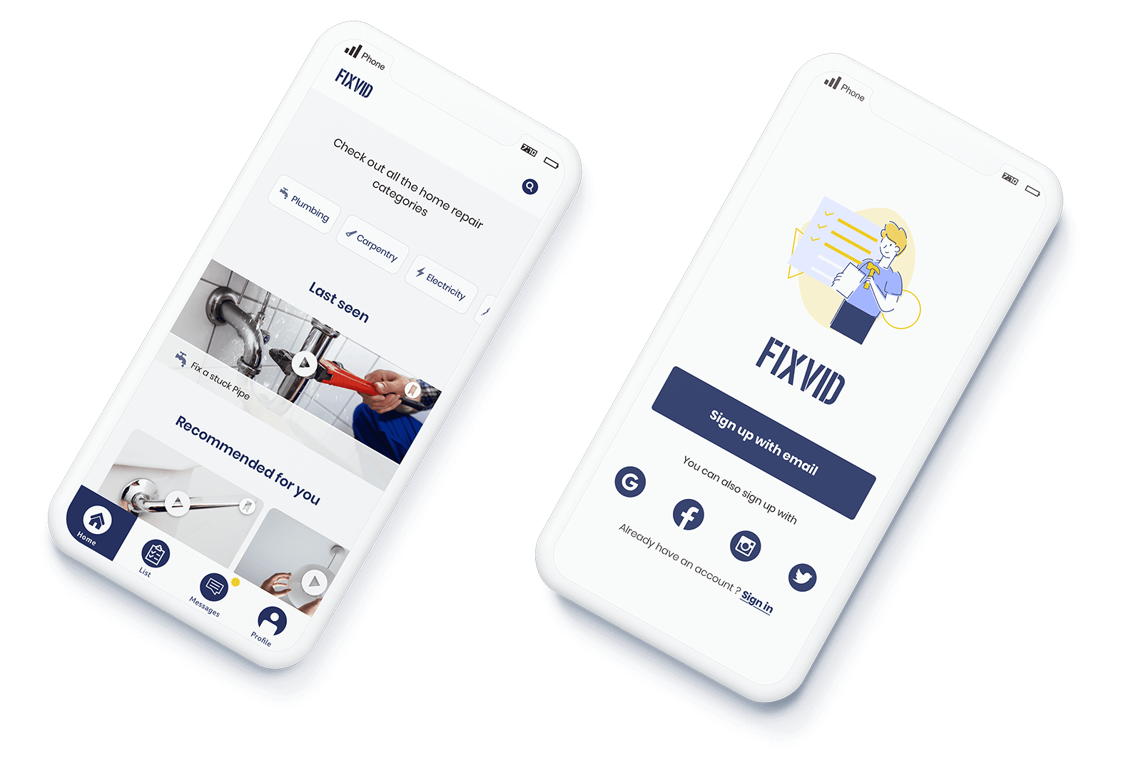
Case study: Design iOS app.
Goal: Help people easily perform house repairs with an e-learning platform for mobile.
Scope: Personal UX | UI Design project.
Role: Solo project where I was responsible for all UX and UI design tasks.
Sketch | Marvel
3 Weeks
How many times something gets broken at our home and we have no idea how to fix it?. We rely on our friends and family to get a helping hand and depend on their availability to get the repair done. If we need to hire someone, these expenses can misadjust our budget for the month.

For the research process, I conducted interviews and shared a survey with people aged between 20 and 30 years old. I wanted to mainly focus on people that lived by themselves or with a partner.
My goal was to understand the steps people take when something breaks down at their home. Who do they turn to for help first? Do they prefer to hire someone to do the repairs?.
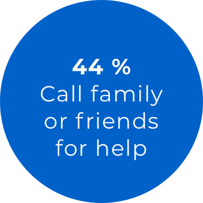

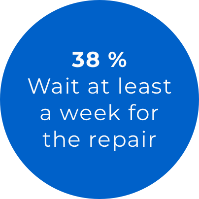
Sample of 34 people
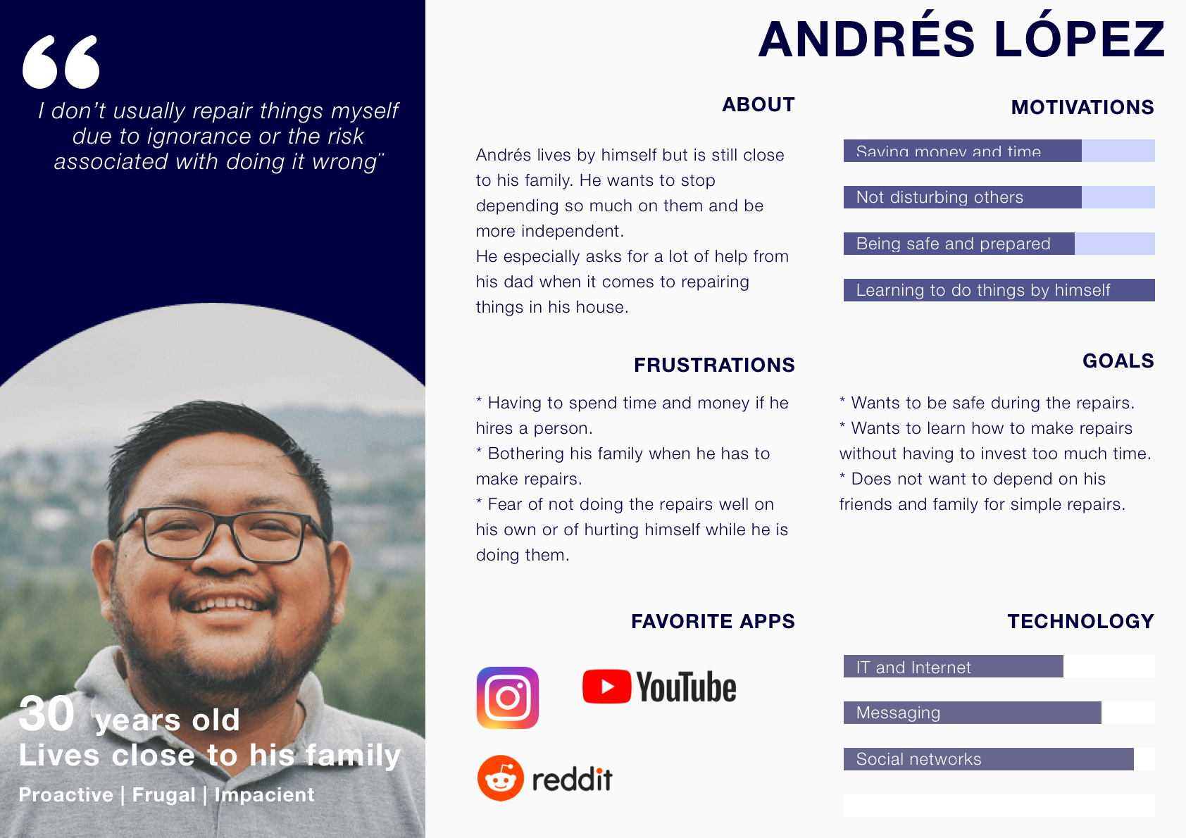

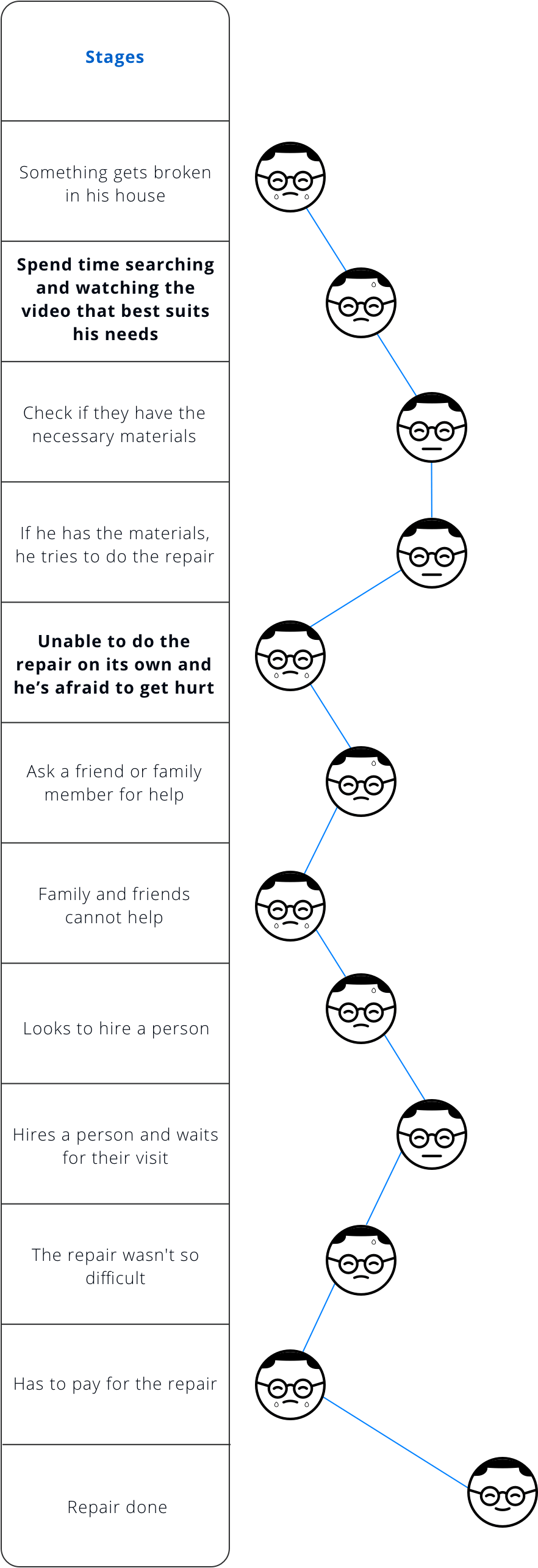
The following image shows Andrés User Journey and all the pain points that are triggered when he needs to do a home repair.
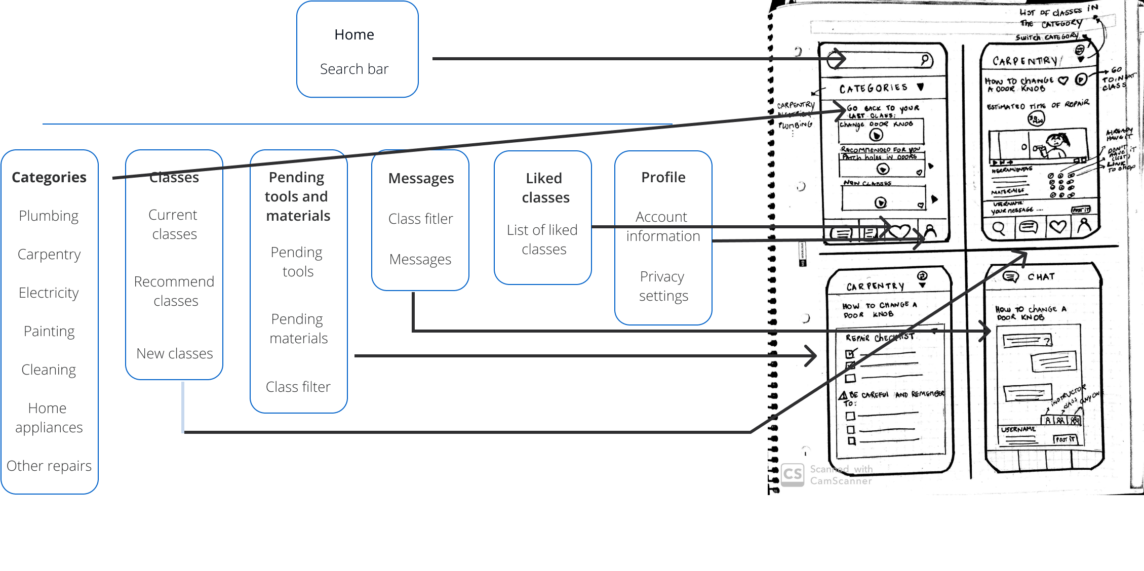
To build the site architecture I worked on the concept sketching, competitive analysis and card sorting to define how the home repair classes will be categorized and structured. From that analysis the following site map was defined. The main goal was for the class contents to be easily found through a search bar or through predefined categories.


The design of the e-learning platform was built as a mobile app since it was the device that most users claimed to prefer during the research stage (51% in the survey).
Below is the user flow when Andrés needs to look for an specific repair. He will need to:
In the project gallery you can find more user flows for the app.
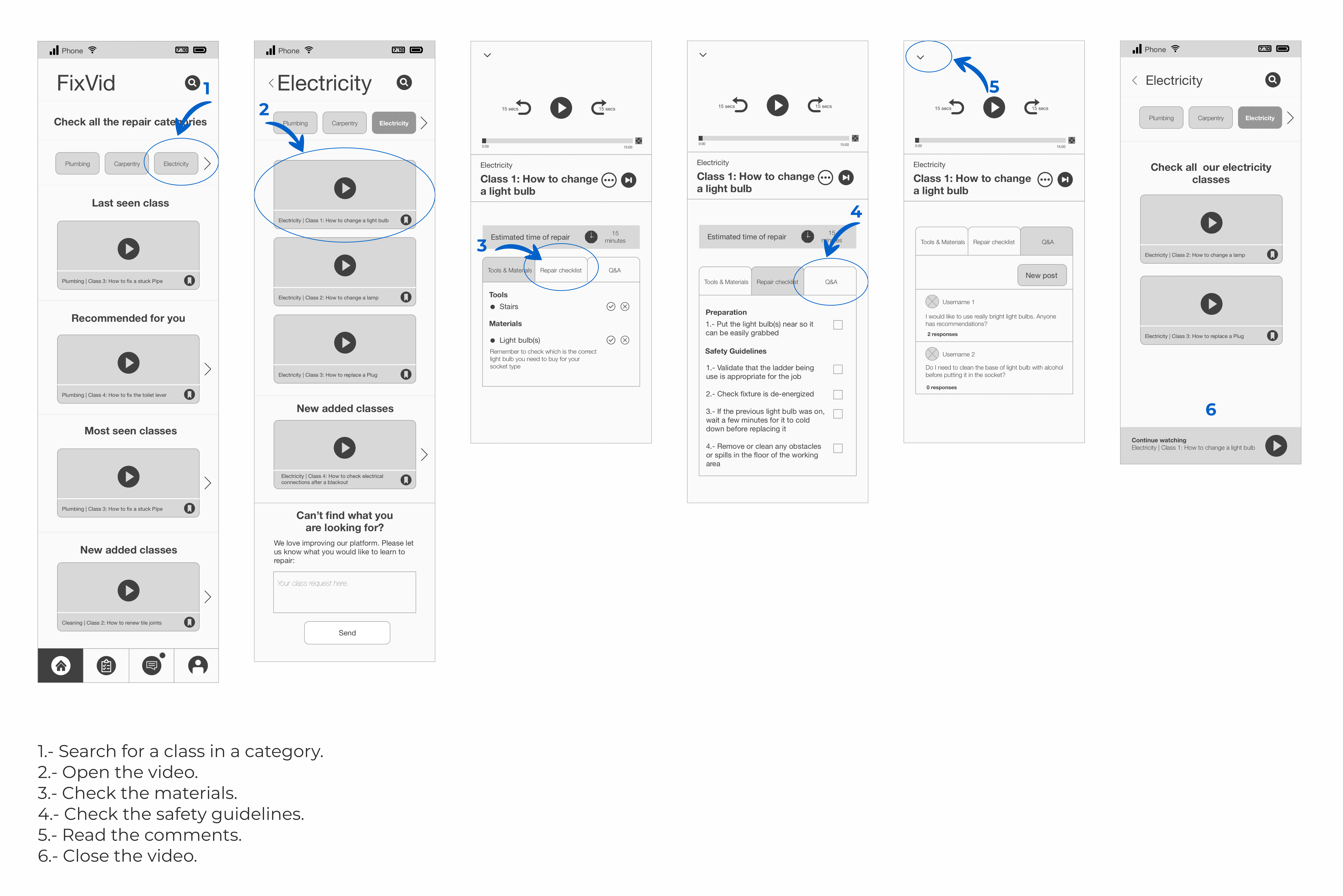

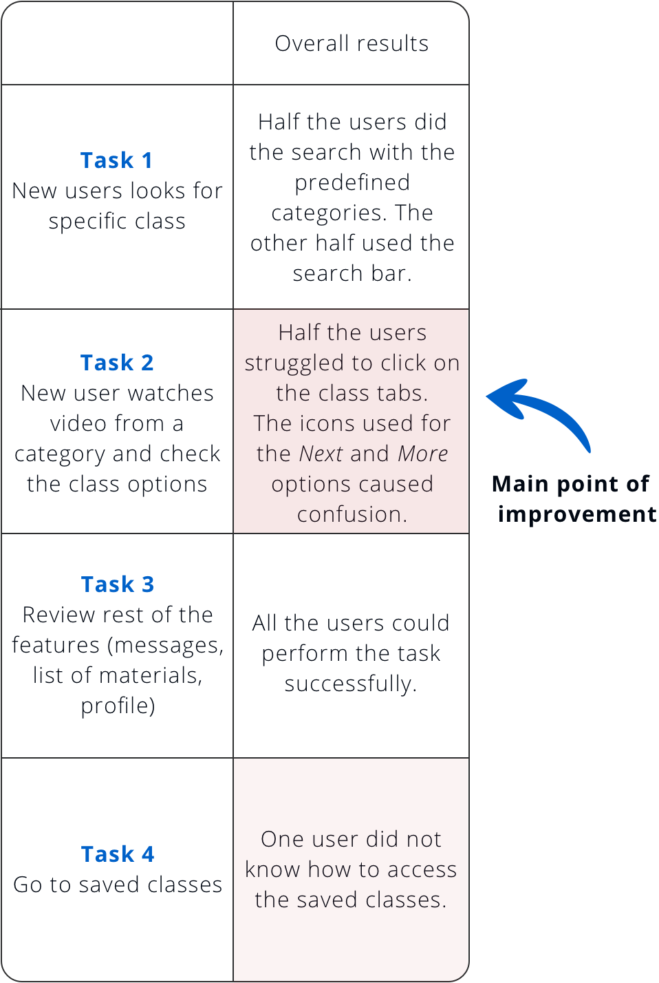
The first version of the Wireframes was tested on 5 users. The results help improve the design and the changes were applied to the mockups shown on the next section.
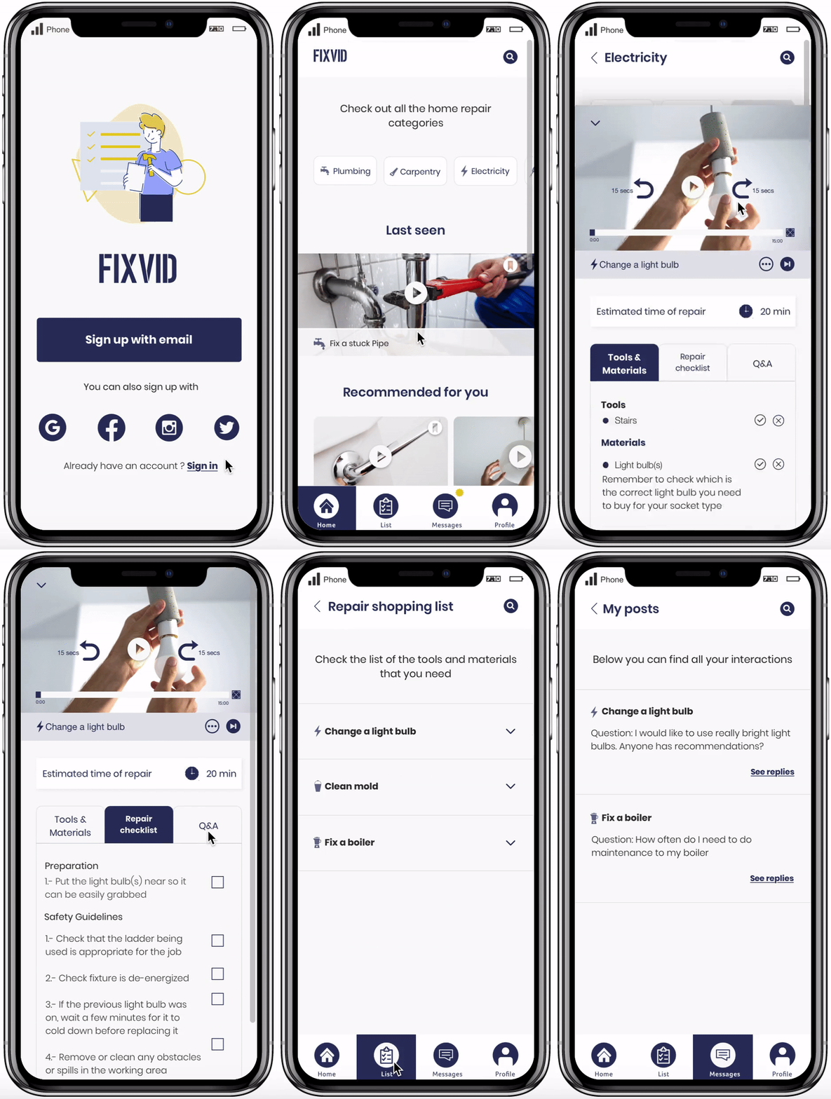
I've got inspiration from the colors of common tools that are used on repairs (tape measure and levels).
#2A3462
#FAFAFA
#EBCA10
For the fonts, I kept a simple design by only using one family, playing with the weights and sizes to stablish the hierarchy.


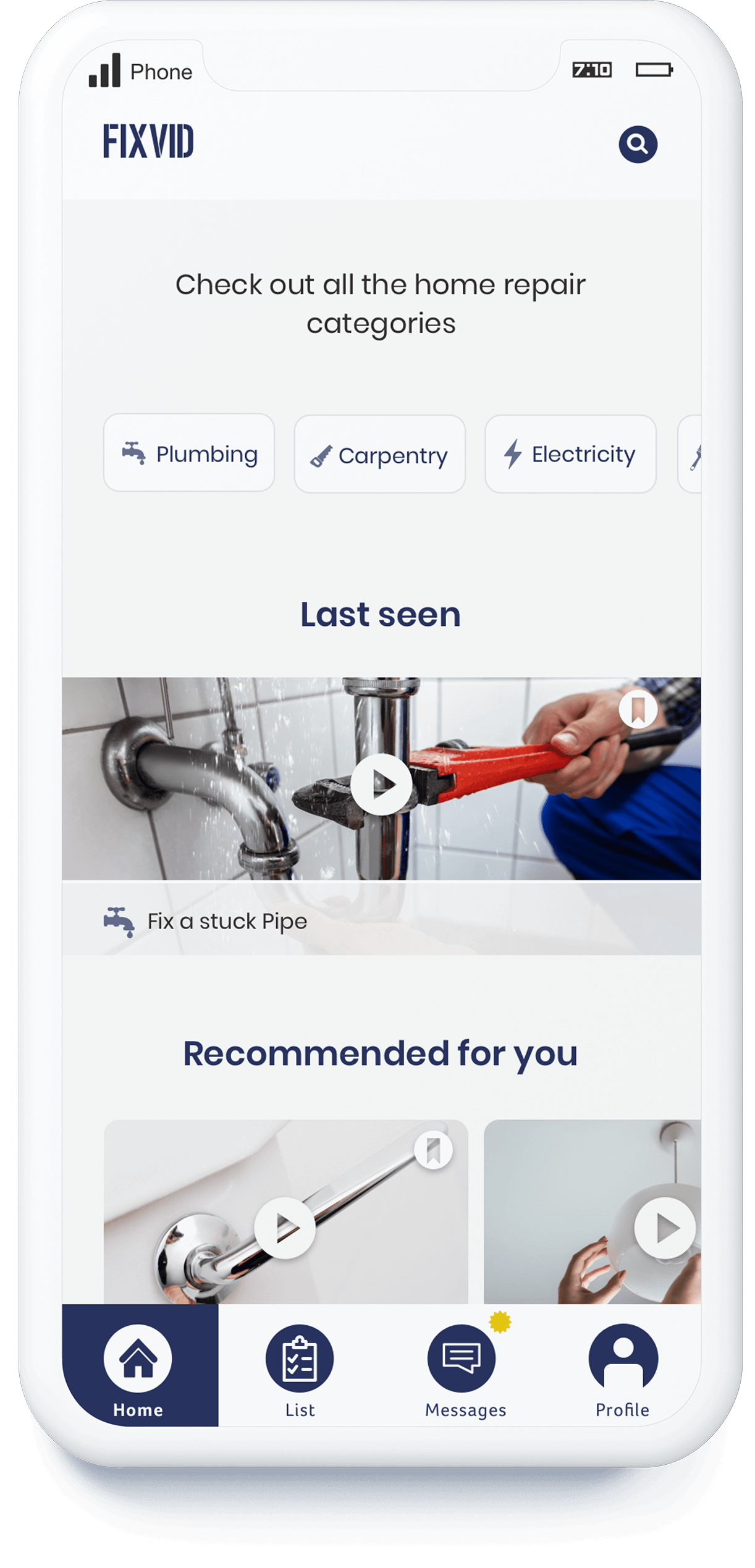
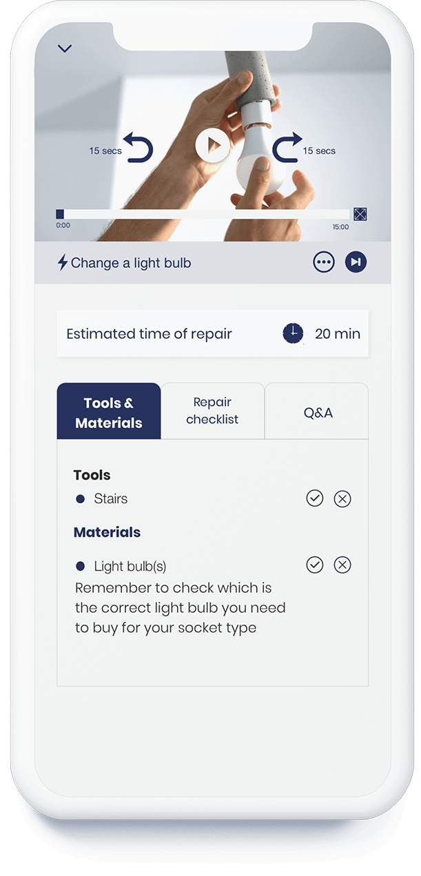
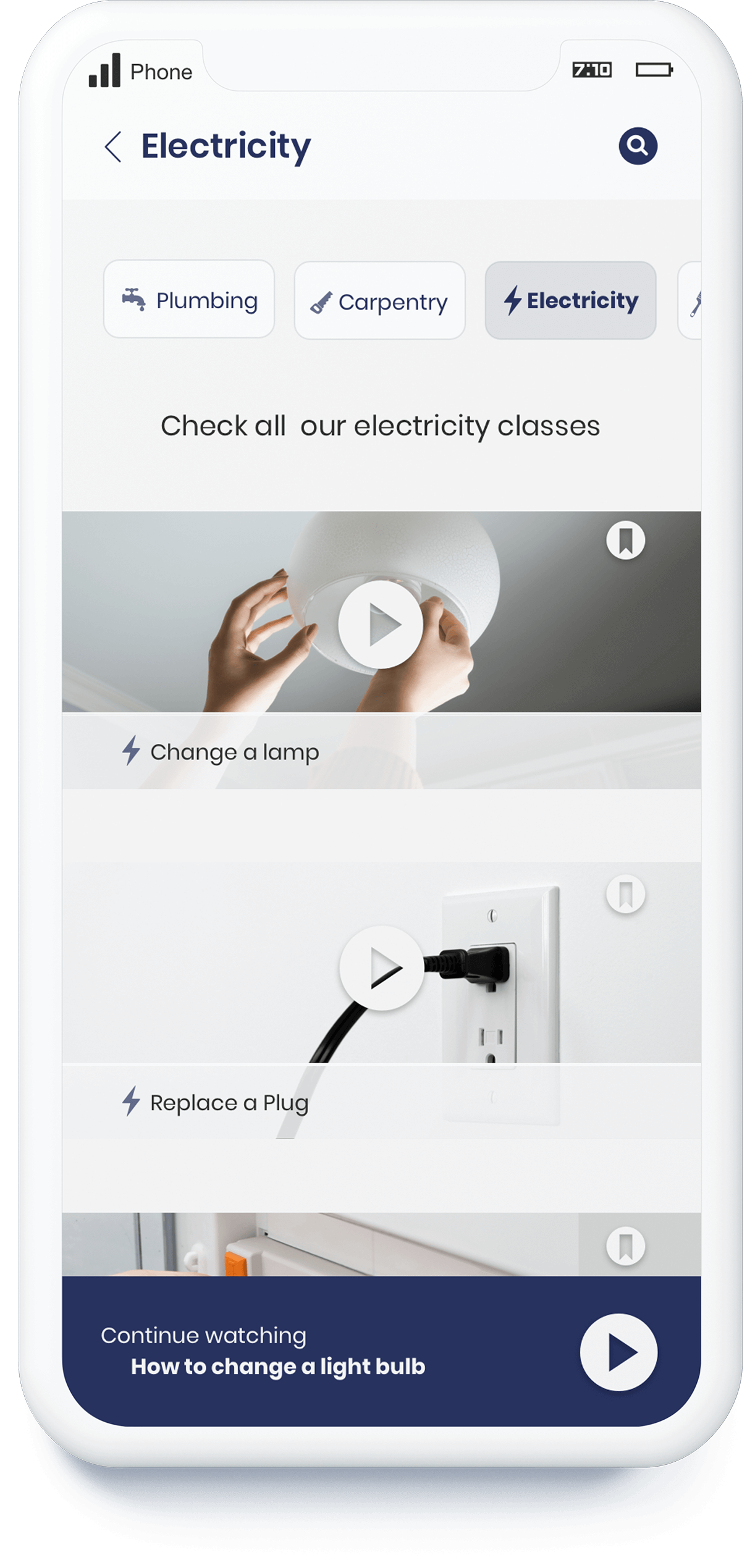
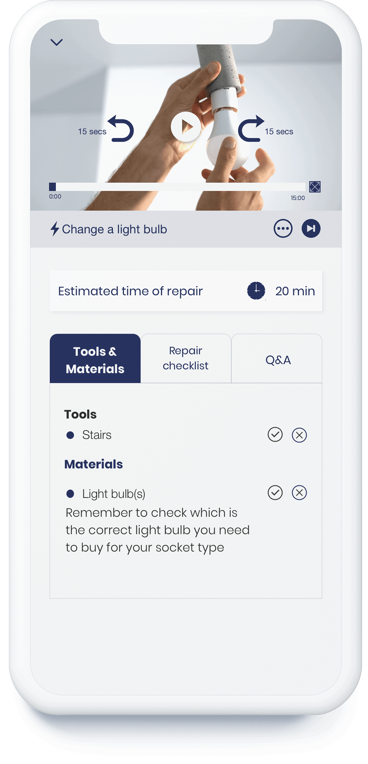
The following gif shows the user interaction when he wants to watch a class.
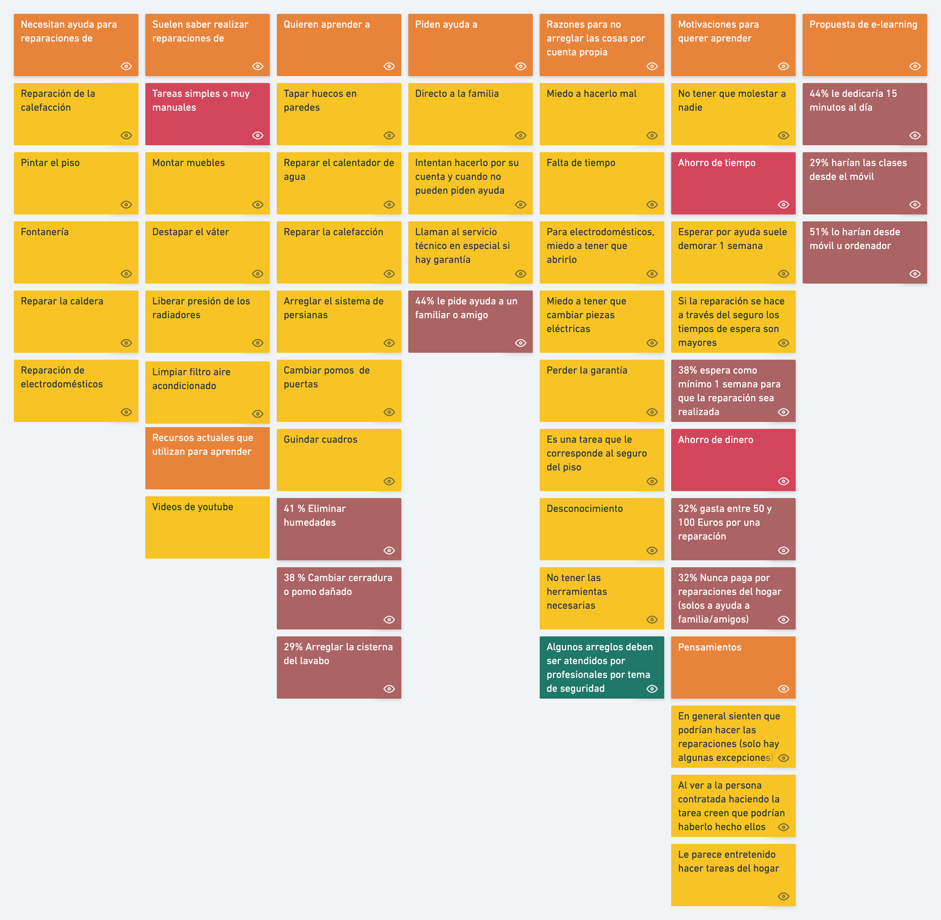
Affinity diagram

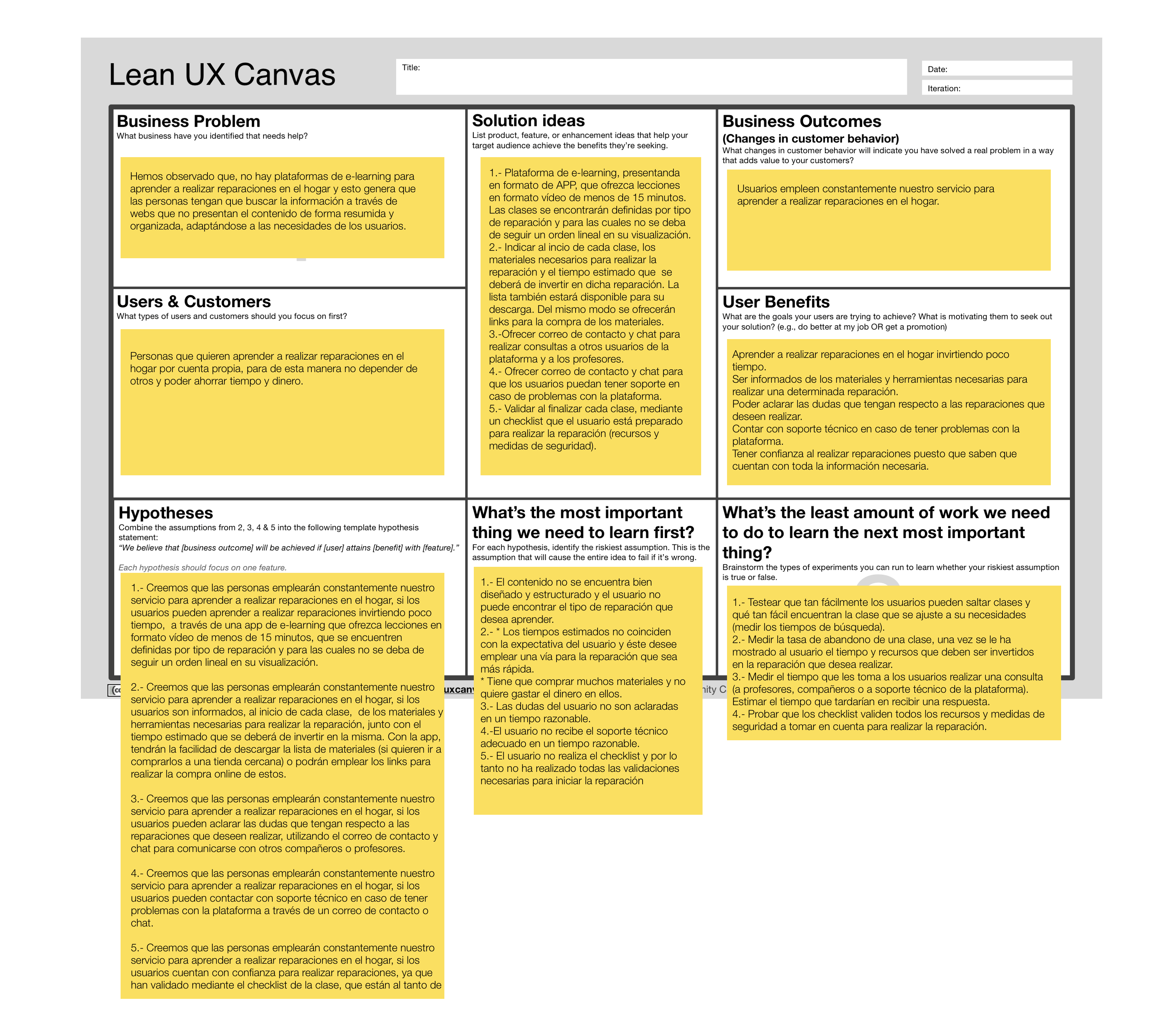
Lean UX Canvas

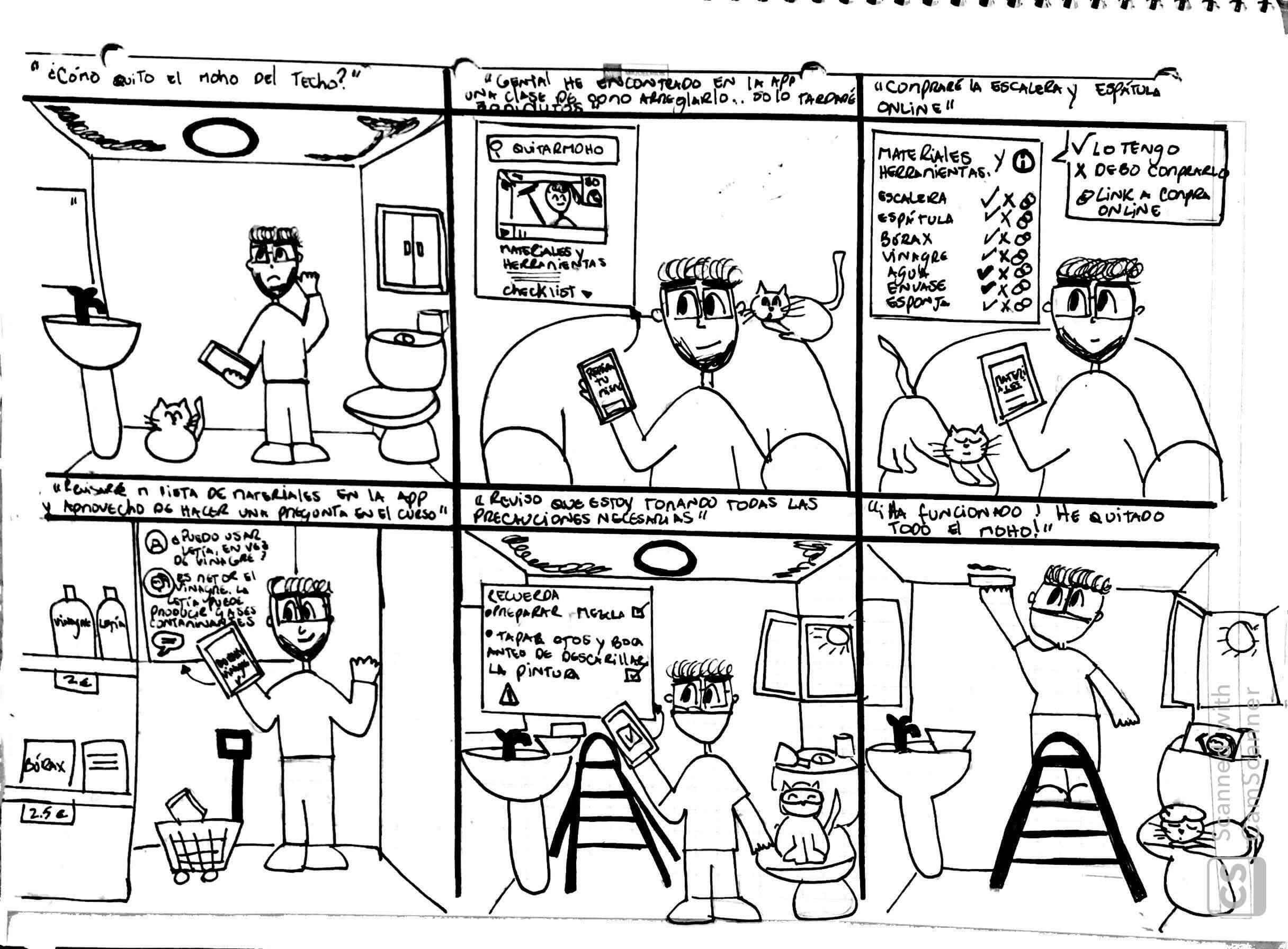
Storyboard


Userflow onboarding
