Streampals:
streaming services recommendations
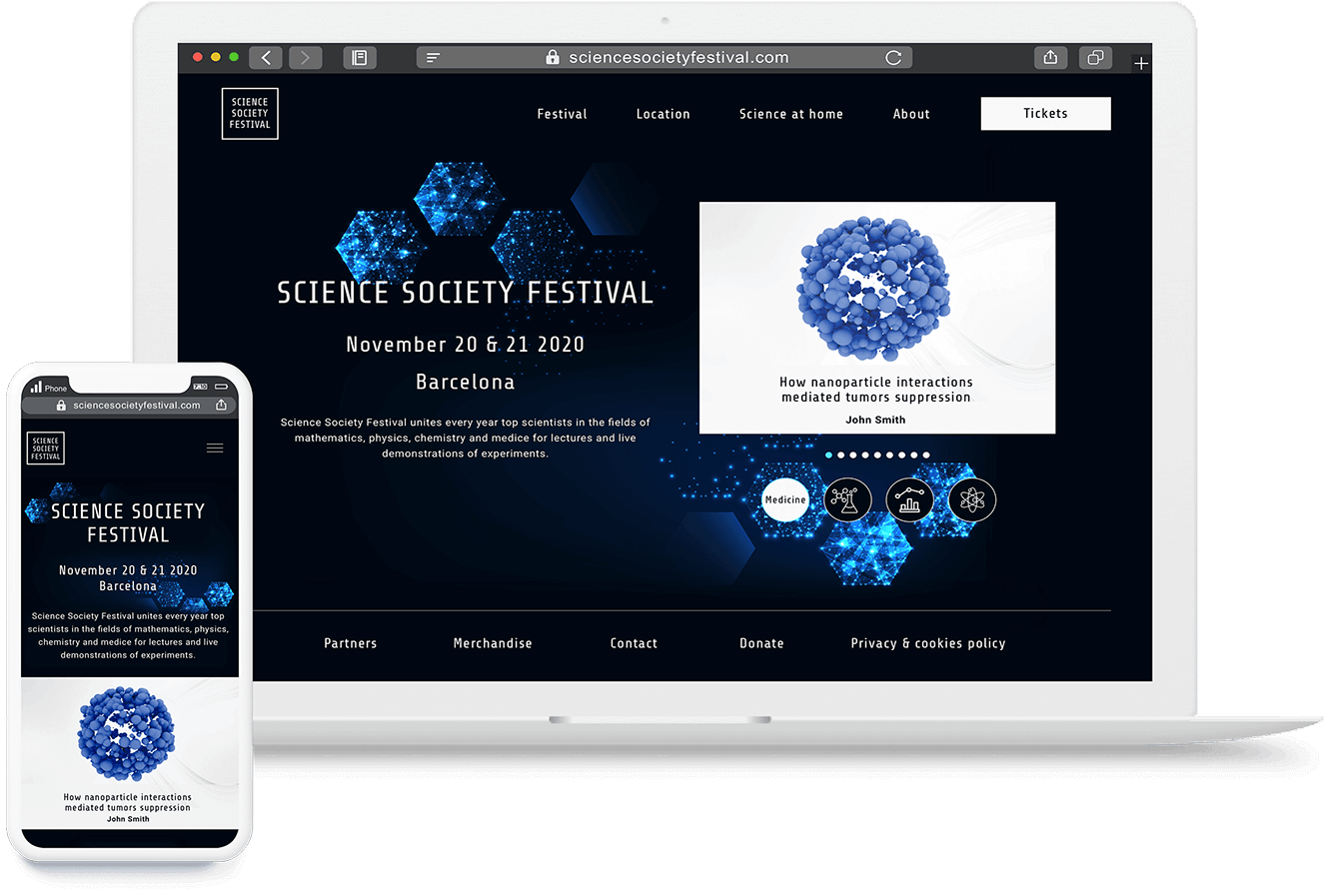
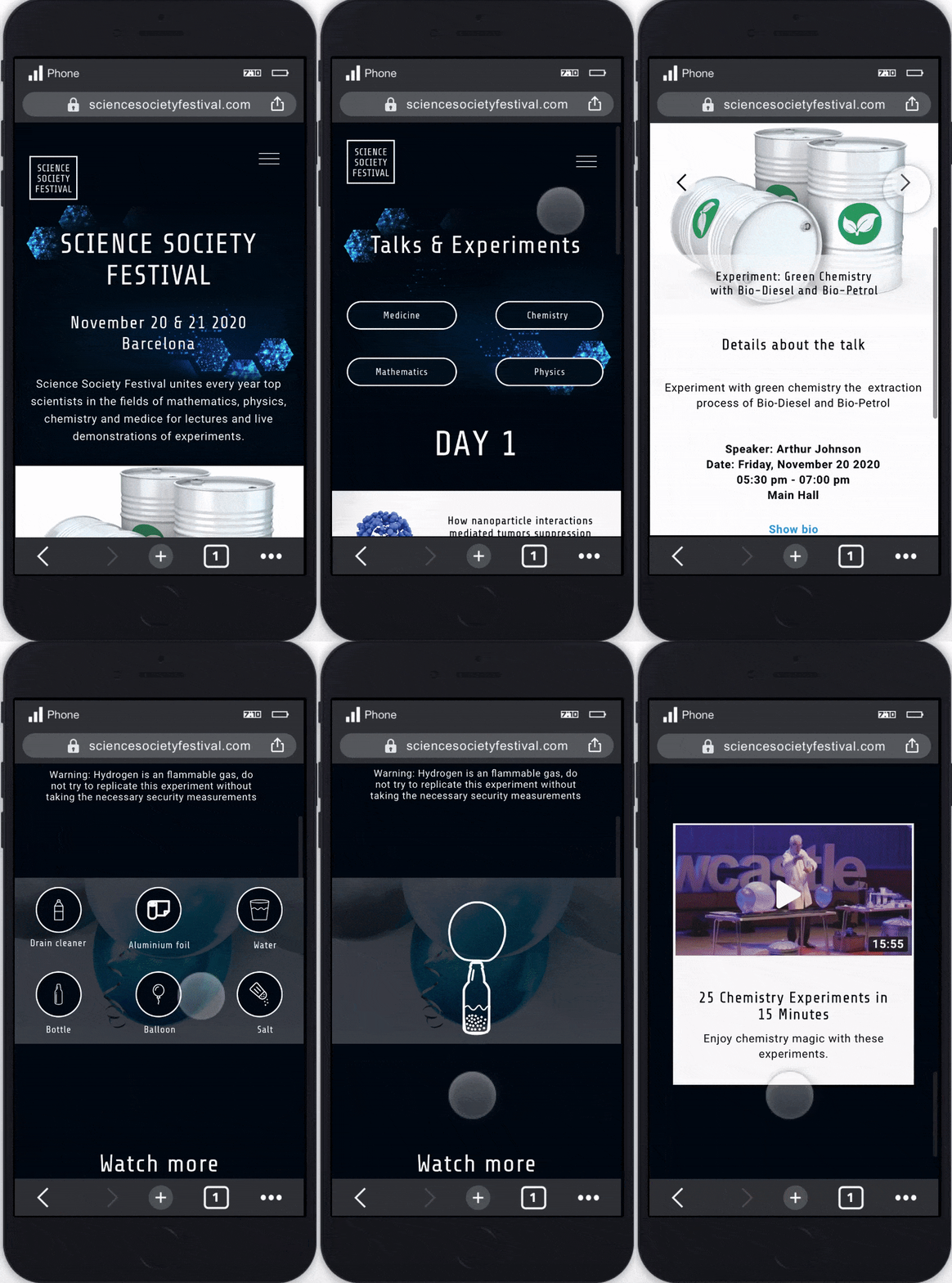
Case study: Design responsive event microsite.
Goal: Allow users to easily access the festival information (participants, talks and location) as well as a simple path to purchase tickets.
Scope: Personal UX | UI Design project.
Role: Solo project where I was responsible for all UX and UI design tasks.
Sketch | Invision
1 Week
Going to a festival is a great experience, specially a science festival where attendees go to get insightful talks and grow their knowledge on different topics (medicine, chemistry, mathematics and physics). A great way to increase the attendance is to provide a useful, informative and easy to navigate site. A disorganized and hard to navigate page can easily discourage people to go to the festival.

There are many science festivals that are celebrated in different cities around the world. For the research stage I ran a competitive analysis based on the following popular science festivals that have a target audience of academics.
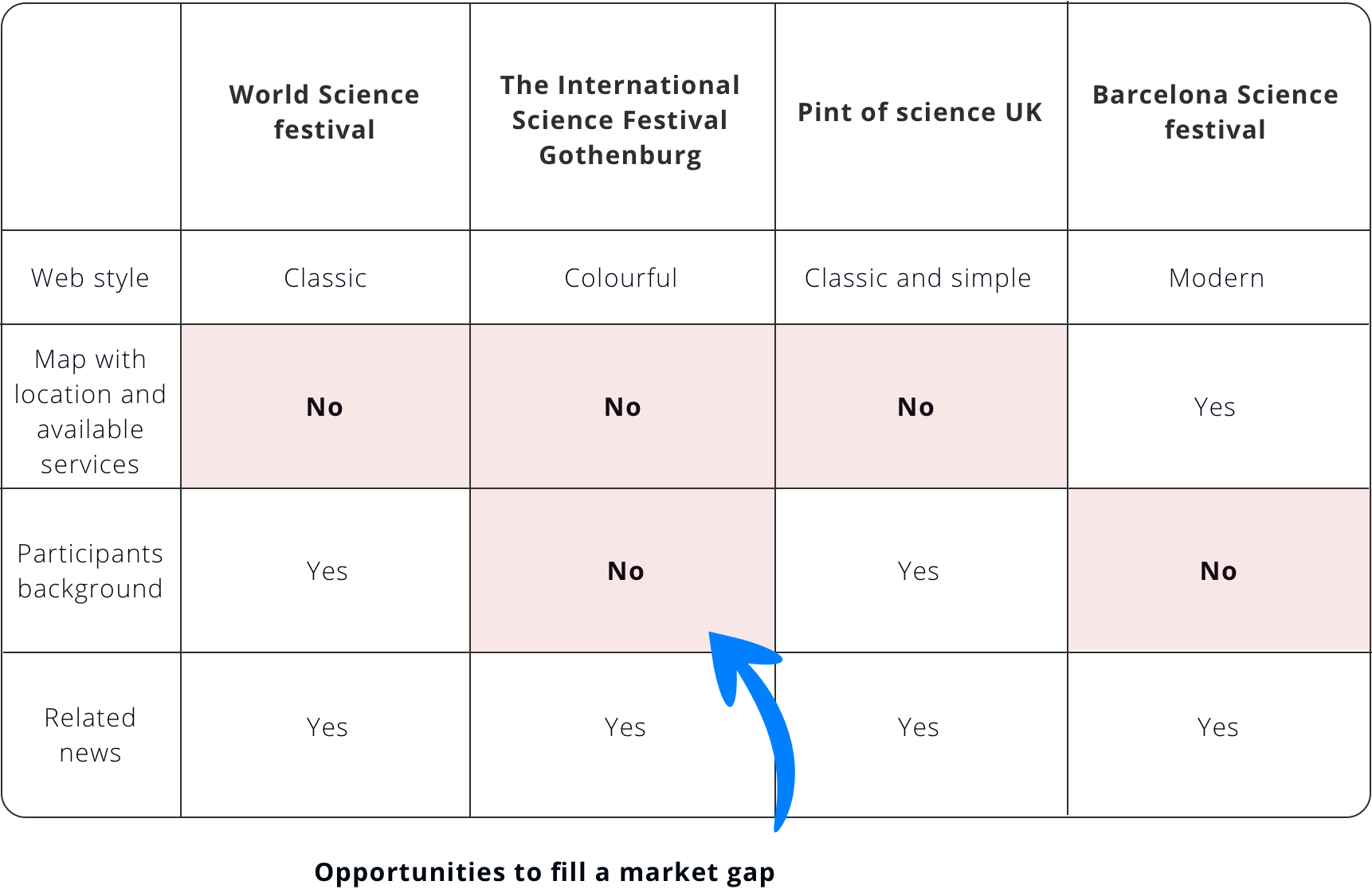
From the research process and the topic of the festival, the following target audience was defined:

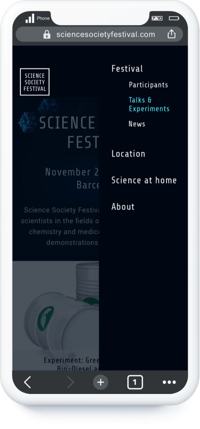
To build the site architecture I followed the insights of the competitive analysis and established the following structure:
The 'Science at home' section is a way to introduce more interaction with the users through an educational process that is linked to the theme of the festival. I set on the footer the rest of sections that are not that frequently consulted by the users. The main focus of the architecture, was to provide an easy access to the ticket purchasing process and to the main information of the event.

Below are the user flows of the web (desktop version) when our users want to purchase festival tickets after reviewing the talks that will be presented.
The testing process was done with 8 users (4 used the Desktop version and 4 the mobile version). Main insights:
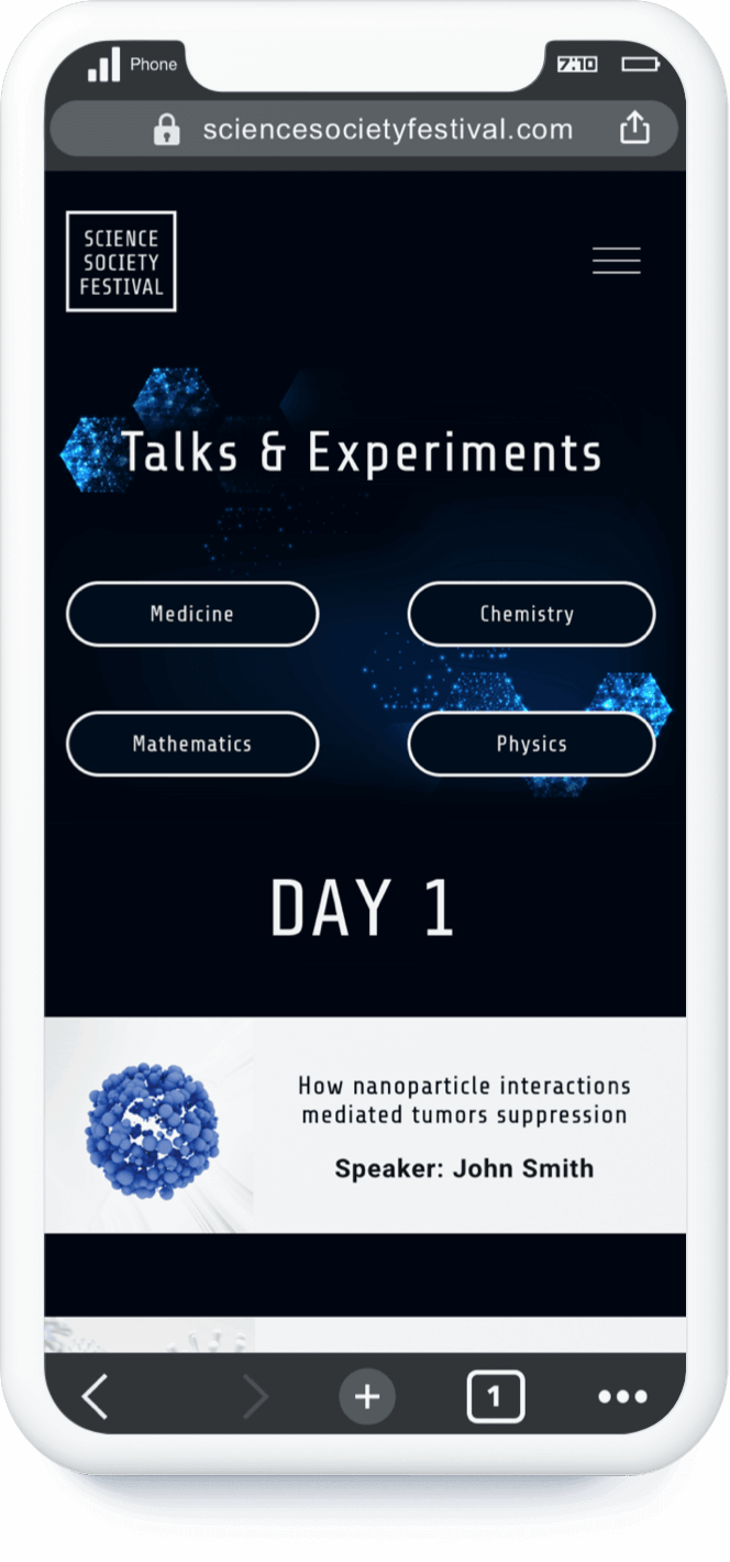
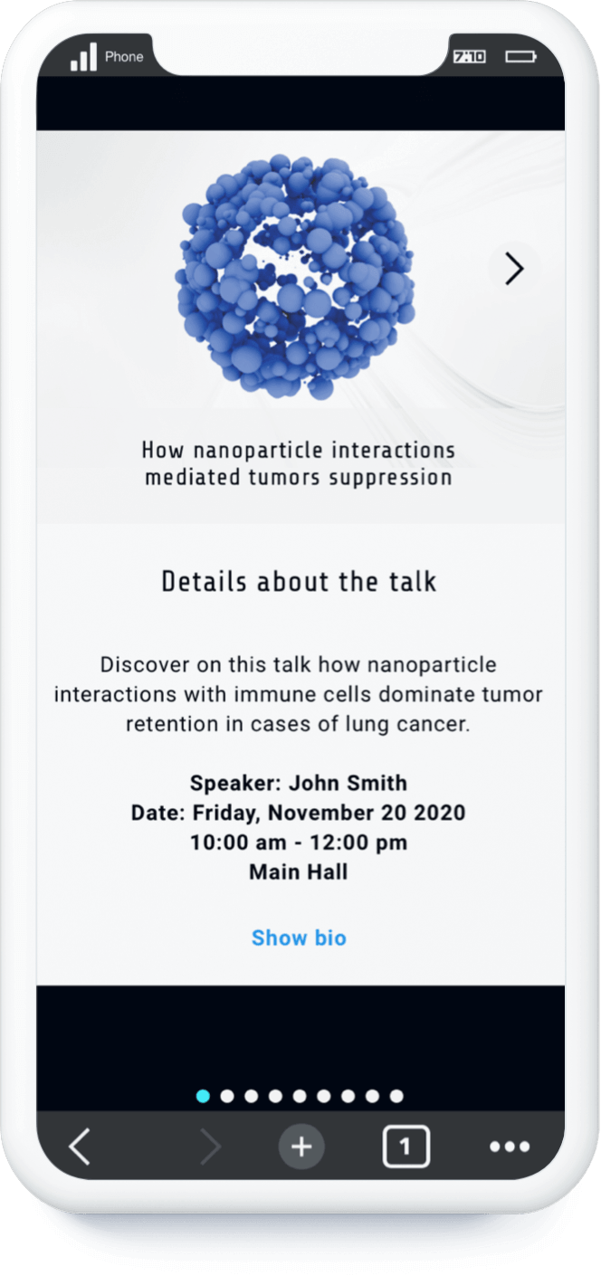
The goal was to present a design that gave a scientific feeling. The treatment of the images was a very important point to keep a clean style that didn't make the site feel overwhelming.
To give a different look to the site I wanted to introduce color. I went with blues since is a color that coveys wisdom and technology, which go hand to hand with science.
#010F1D
#46EFFE
#FAFAFA
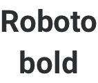
For the fonts, I used Share Tech for the headers and Roboto for the text bodies. I chose Share tech since it reminisce scientific articles and Roboto for its readability.

