Streampals:
streaming services recommendations
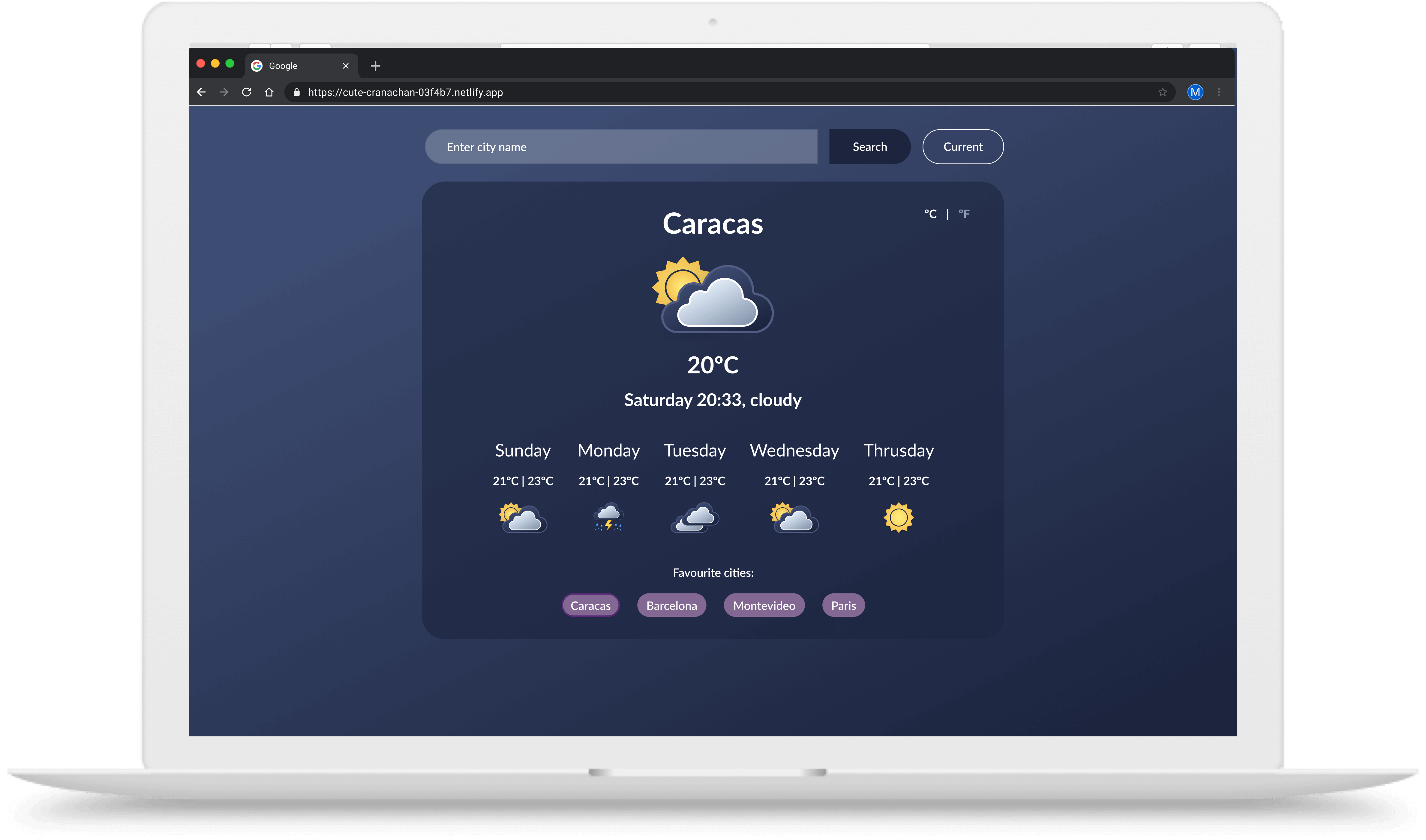
Case study: Design and develop a weather web app.
Goal: Allow users to check the weather in any city.
Scope: Personal UI Design | Front-end project.
Role: Solo project where I was responsible for all UI design and Front-end development tasks.
Figma | Visual Studio | Github
3 Weeks
Checking the weather has become a daily practice for most of us. As users, we check the weather in our location, and if we are going on a trip, we want to see how the weather will be in that location. Added to that, lots of us have important family members in different cities and countries, so we want able to access these special cities in an easy way.
The final goal was to design and develop a weather app using HTML, CSS and Javascript.
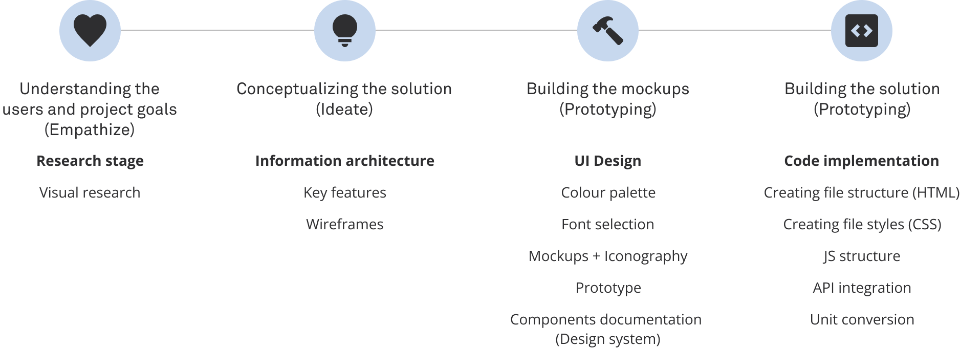
For this project, I ran a visual research of Behance and Dribbble of weather apps. I also took inspiration from well-known weather apps, like Google forecast. Since the goals and expected results for this project well already defined, I did not run more thorough user research.

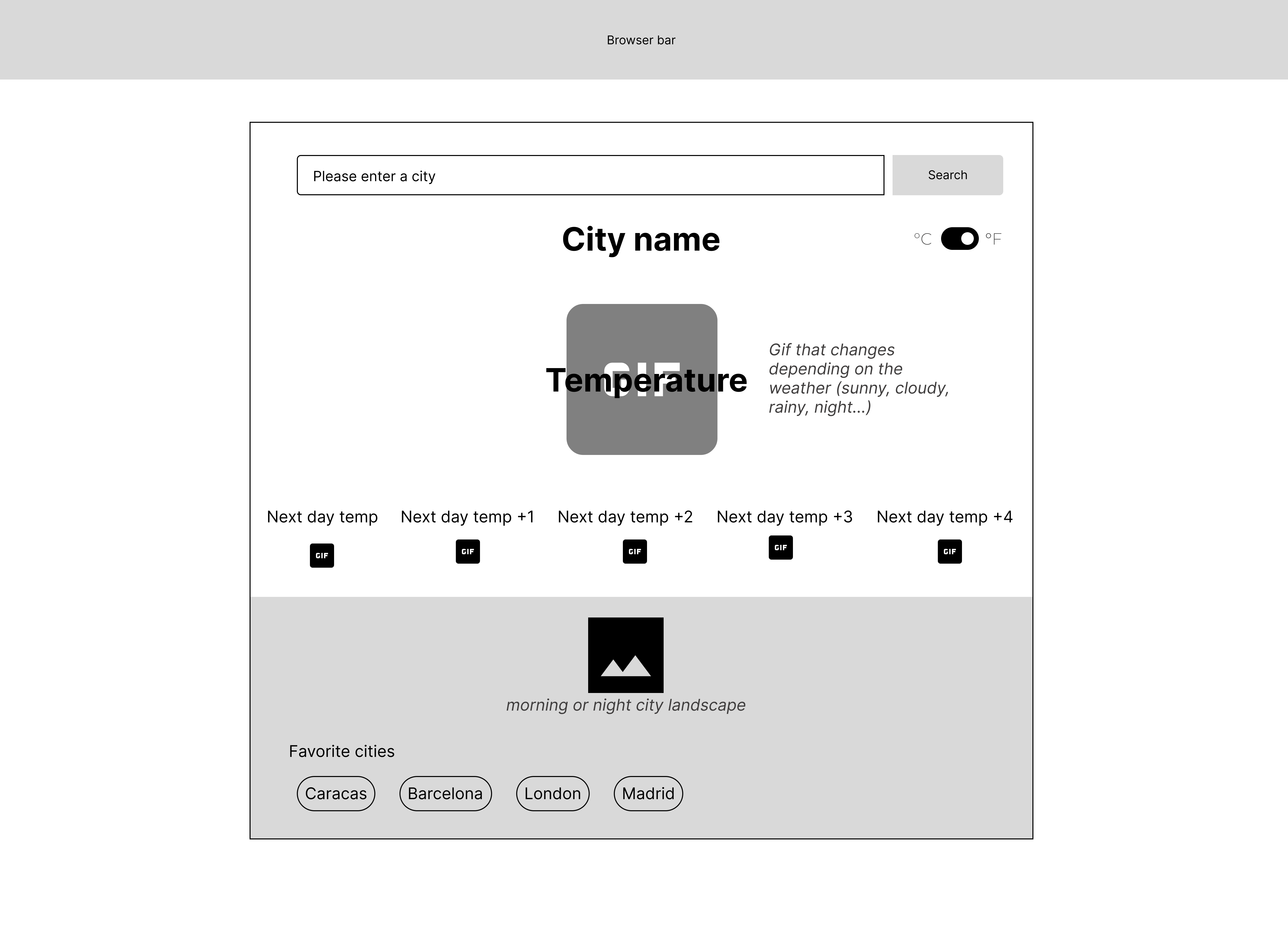

This project did not have any visual guidelines. My goal was to create and elegant and curent look and feel.
I went with greys and mauves since they will match with the colours of the iconography (light blues, white and light greys).
For the font, I used Lato for the headers and text bodies. The roundness of Lato goes also hand in hand with the iconography. The image below shows the documentation of the colours and font.
The iconography was created exclusively for this project using Figma. I have to create an icon for the different weather types that the weather API offered.
Although this is small project UI wise, I still wanted to show the way I would document components. The colours, fonts, buttons and search bar, were documented on Figma and represent how I would do a design handover to devs.

For the coding of this project I had to:
Check out the live version
Check out the Github project